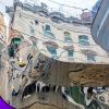
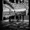
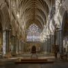
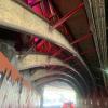
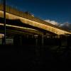
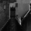
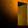
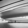
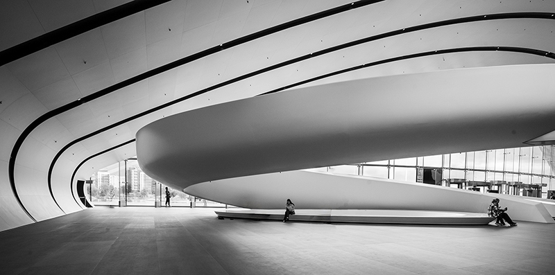
The Gazprom Tower in St Petersburg is Europe's tallest building, and a photographer's dream inside and out. This is one of my favourite shots, but I'm not sure if it works. Look forward to comments.
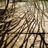
Nice pattern based image that suits monochrome, I don't think it would work in colour.
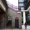
I like this type of architectural shot showing these pleasing curves. The small figures enhance the overall image giving scale and B&W is definitely right for this image.
Dave
I quite like it, but I'm not sure it works either. My initial reaction is that if this is an architecture shot (of course it is!), then you don't need all those people - I'd keep only the one at the glass door/window, and remove the others.
I think I would also try a crop at the top, cropping to midway between the two black stripes at the top right. I think this emphasises the ceiling more. I do like the impression of stonehenge at the back right too :-)
Great image, I think the mono approach works well and I like the variety of tones in the image, i tend to agree with Des with reducing the number of people, maybe a single figure just to give the impression of scale. One thing that throws my eye to think its not level is the windows on the right hand side are sloping but the floors look level.


Comments
The Gazprom Tower in St Petersburg is Europe's tallest building, and a photographer's dream inside and out. This is one of my favourite shots, but I'm not sure if it works. Look forward to comments.
Nice pattern based image that suits monochrome, I don't think it would work in colour.
I like this type of architectural shot showing these pleasing curves. The small figures enhance the overall image giving scale and B&W is definitely right for this image.
Dave
I quite like it, but I'm not sure it works either. My initial reaction is that if this is an architecture shot (of course it is!), then you don't need all those people - I'd keep only the one at the glass door/window, and remove the others.
I think I would also try a crop at the top, cropping to midway between the two black stripes at the top right. I think this emphasises the ceiling more. I do like the impression of stonehenge at the back right too :-)
Great image, I think the mono approach works well and I like the variety of tones in the image, i tend to agree with Des with reducing the number of people, maybe a single figure just to give the impression of scale. One thing that throws my eye to think its not level is the windows on the right hand side are sloping but the floors look level.