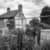
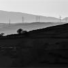
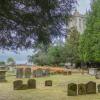
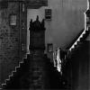
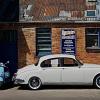
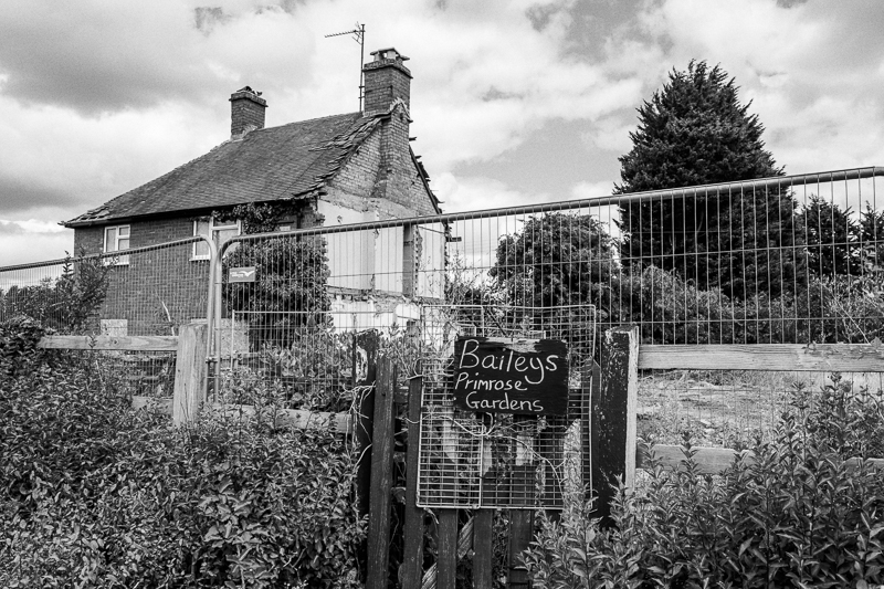
This photo, taken on Sunday’ of part of the Tewkesbury Road widening “development”. I think it is a somewhat sad photo. I thought the old notice of “Primrose Gardens” contrasted to the current condition of the area. I think colour didn’t add much and monochrome enhances the image.
It seems the garden and the house have gone. I am sure that there will be more devastation along the A4019. The problem is once they allow development in Green belt, other developers use this as reason to further develop. It is also important to capture these photos for historical record.
Dave
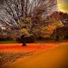
For me the tree is a little overpowering and not really the subject. I would crop in from the right but still leave the top of the tree, so that maybe a third of the bulk of the tree is out of the picture. For me that makes you look at the sign (on the third) and then the house, with the tree just as a stopper on the right. It makes it nearly square so you could lose a little from the left to make it really square.
I think I agree with Des re the cropping a bit of the tree, this then makes the house and sign more dominant in the image.




















Comments
This photo, taken on Sunday’ of part of the Tewkesbury Road widening “development”. I think it is a somewhat sad photo. I thought the old notice of “Primrose Gardens” contrasted to the current condition of the area. I think colour didn’t add much and monochrome enhances the image.
It seems the garden and the house have gone. I am sure that there will be more devastation along the A4019. The problem is once they allow development in Green belt, other developers use this as reason to further develop. It is also important to capture these photos for historical record.
Dave
For me the tree is a little overpowering and not really the subject. I would crop in from the right but still leave the top of the tree, so that maybe a third of the bulk of the tree is out of the picture. For me that makes you look at the sign (on the third) and then the house, with the tree just as a stopper on the right. It makes it nearly square so you could lose a little from the left to make it really square.
I think I agree with Des re the cropping a bit of the tree, this then makes the house and sign more dominant in the image.