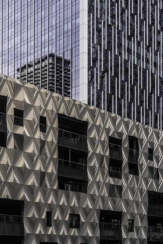
Super image! For me Colour, it seems the white building corner in the top center is less eye catching, and the colour version also seems to have more depth.
I would crop the tiniest sliver off the bottom, just to remove the tiny black windows, and a little more on the left so the window in the middle of the left edge goes - cleans ip the left edge nicely.



















Comments
lovely critique hive mind, mono or colour?
Super image! For me Colour, it seems the white building corner in the top center is less eye catching, and the colour version also seems to have more depth.
I would crop the tiniest sliver off the bottom, just to remove the tiny black windows, and a little more on the left so the window in the middle of the left edge goes - cleans ip the left edge nicely.
Should do very well in Harry Sedgwick!!
Cheers Des :-)